![]()
![]()
![]()
![]()
![]()
|
|
|
|
|
|
|
I'd been thinking about doing something with greens, so, naturally, the first step was to put some red and black onto the canvas. Here's the first image:
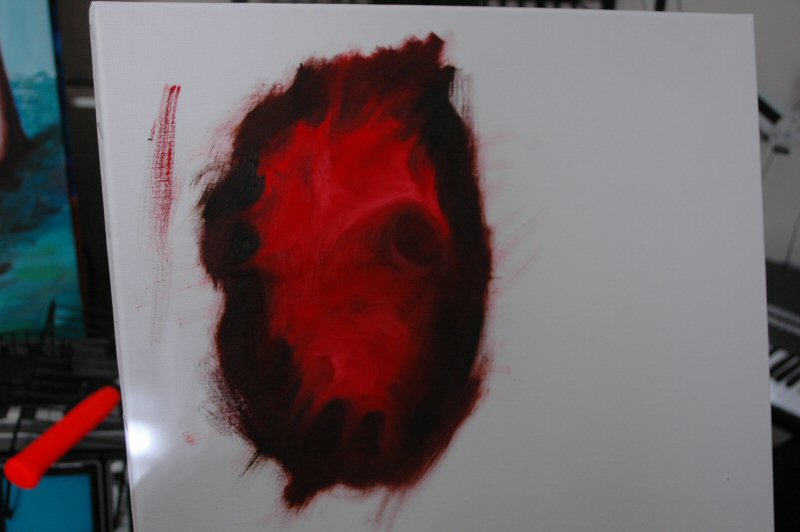
Well, to be strictly factual, here's the first image:

This, of course, then led to this one. Back we go:
The reason I led with red and black is quite simple: I already
had some on the palette. I have a horror of, well, many things, but
wasting paint is certainly among their number. I mean, I also had an
idea of how this could be used in the canvas, of course; I'm not a
total prisoner of my obsessions.
Well, having cleansed the palette, as it were, of red and black, I then began to add green.
Specifically, "Sap Green," which is named so because if you
use it, you're a sap. It's almost Raw Sienna in its difficulty; it
took forever to simply spread it to the extent you see here, by which
time I had decided to abandon such a color. Life is simply too short!
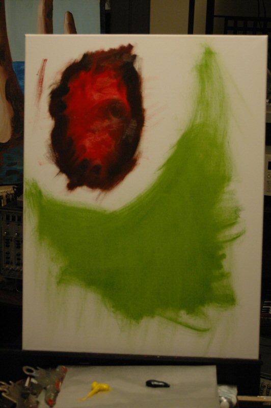
As you can see, what we have is An Extremely Sun-Burnt
Pee-Wee Herman Enjoying His Role in the Saint Patrick's Day Parade In
His Pterodactyl Costume.
Actually that's not the title,
but I bet I've given one of you an idea for an off-Broadway
play.
Well, we took another green, a bluer one that I can
never spell (Phylocasomethingorother) and we took some yellow, and
filled the rest of the canvas.
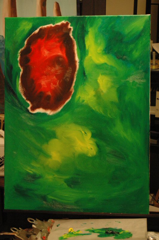
Then we let it sit for a while. Actually, rather a while, an
entire day in fact, since what you've seen above was produced on
Monday.
On Tuesday, we went in and fleshed out some details.
The yellow and green were both quite damp, so this makes smoothing a fairly easy task, at the same time hard edges are kind of
difficult.
Also, we added some detailing to the red and black
area, and closed the circle around this by edging the black right up
to the green. The result:

So that's that. I suspect I'll wait for it to dry properly
before doing any more.
You're probably saying to yourself,
"This person seems to go pretty quickly with the more abstract
things, I bet that's why the more realistic PaintBlog II is so
stalled now."
Well, you don't have to say that to
yourself, you know. You can say it right here, and everyone can join
in agreeing with you. How about it?
In this picture, we go from smooth to
tacky, by which I refer to the amount of stickiness that the paint
retains after a couple of days of drying. Green is pretty well set,
but yellow is now somewhat glue-ish, so smoothing is more difficult.
(One can smooth by either blending in with the existing wet color, or
by slowly fading out over an existing dry color.)
I did some
area work in the upper left corner, but I was unhappy with it (it
seemed too dark, and thus too sunken) so I lightened it up--brought
it closer to the viewer, as it were. I'm going to try to get the two
photos side by side.
|
|
|
Notice that the upper right corner looks a bit
like Jack Skellington. Much as I like Jack, and feel that he serves
as an excellent example, I'd rather he not appear in my pictures. So
that will change, definitely.
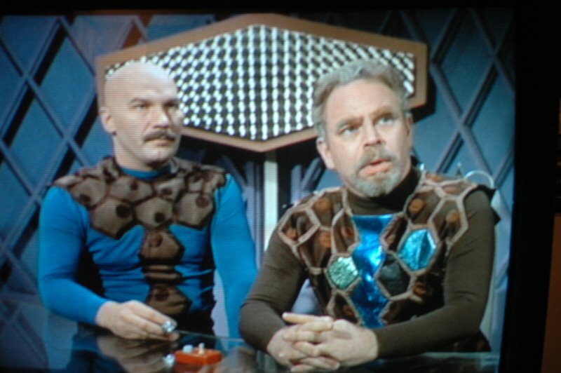
Busy session bassist Tony Levin
and Dave Cousins of the Strawbs came by the studio. They said the
work was "interesting" and then they quickly wanted to talk
about other things.
Here's some kittens from the W.C. Fields film, "International House."
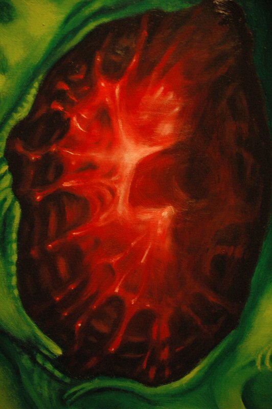
Did some work on the red and black area. The green and yellow has to dry a bit more before I'm going to do anything with it. When I woke up this morning, I thought the lower center-left area of the red thing was too bright, so I darkened it up a bit. Photos below.


The green and yellow area is pretty lucky, as it is only those
two colors, and it's pretty easy to blend two pretty compatible
colors. That's why the next step may utterly destroy the work: adding
black and white for shadows and highlights.
(As always, when I
say "black" I mean "raw umber.")
Spent the weekend doing errands and working some on PaintBlog III.
The first thing I wanted to do was to change the green area in the
upper right, so that it looked less like a face.
A good rule
of thumb for this is, if you can't dazzle 'em with design,
dumbfound them with details. So, a number of cells were added,
and intertwined, and generally made into a confusing mess...which
still looks like a face. *Shrug*
Okay,
it looks like a face, I thought to myself. Yeah, myself
thought back, but then, so does the right side of the red
area.
No, it doesn't, I thought, startled in
spite of myself.
Yes, it does. It totally does.
Well,
this sort of pointless bickering continued for some time, before I
thought, well, let's see if we can do something with this.
Let's
say, just as a speculation, that the green face was over the red face
originally, and that the red face has, so to speak, hatched, and
pushed the green face aside. What would be needed to foster this
state further?
Well, we need to make the green face appear to
cast a shadow over the read face.

This
shadow, for now, only affects the green area near the red face; it
will have to be spread over the red face as well, to some
extent.
The next thing to do is to make the edge of the green
face appear to be a continuation of the green area where the red face
is emerging. This is pretty simple, really, we just add some
highlights to kinda sorta match the rippling on the green area.
Like
so, with the intended effect illustrated with arrows.

Still no black and white highlighting of the green and yellow
areas; with this new twist, that's been put off a bit longer. See you
soon with some more results, maybe, possibly, yeah!
Lots of work last night, though some of the details may be too
small to really make much of an impact in the accompanying
photographs.
This is basically what we started with:
I was moved to work on the red and black, again. I started
applying some shadows to the right side of the red face, where the
greenface would overhang it.
Then, I began detailing the red
face. I used small bits of white on ridges and things, which gave the
whole thing a wet, organic look. Below, you can see a preliminary
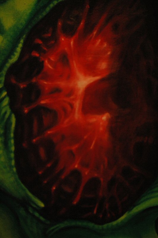
version, next to a "final" version. The differences are
pretty small (mostly near the bottom of the face), and, as you can
see, the image on the right is a bit darker than it ought to be.
|
|
|
Before, this guy looked ominous and vaguely
threatening. Now, he still has both of those qualities, but we can
add a third: disgusting.
As they say at McDonald's:
I'm lovin' it.
Next, we added some
bits to the left side of where red face is emerging, so that it would
somewhat match up with green face.

Following that, we changed the shading on the tongue-like structure at red face's lower right (from the point of view of the viewer, not red face) so that it looks like part of the structure that has hatched.
So: here is what we have as of today. I'm putting in two pictures because a) I can, and b) the two are exposed a bit differently, and each gives a different air to the work.
|
|
|
I used more brushes last night than in many a moon; to be
fair, though, that's because I would clean what I had and suddenly
think of something else to add.
Sometime today, I'm going to
try and update the Index
file for these things.
Well, it has been a while, hasn't it? Don't get any ideas, though, I'm not rolling these things out very quickly. In fact, I hadn't painted in days before I got insipid and did some detailing work. And that's all you're getting, too, just detailing work.
Things go slowly sometimes. That's because they're not going faster than they are. If they were going any faster, why, they might explode or something, and we wouldn't want that. Much.
Well, the day of dread has arrived, as I began to add white to the largely green and yellow areas. The first attempt was pretty bad, and sad to relate, I didn't photograph it. The photo below shows what it looked like when that first white attempt was improved a bit.

Only it wasn't improved too much. Can you see the bunny? I could. I had to...eliminate the bunny. The bunny had to go.
Not much of a bunny. Then, we decided to add some shadows. We did this by mixing raw umber with whatevertheheck green we'd been using all along.
And then some more shadows. More shadows and more. The area in the mid-lower left looks like some struggling trapped thing. Struggling trapped things are pretty cool items to have in a painting, especially if it's one of my paintings. In fact, that's about the only role available in my work.
This is a somewhat darker image, perhaps a bit closer to the actual canvas appearance.

Though maybe not. It's probably somewhere between the two extremes. I can't remember any more. I just can't remember.
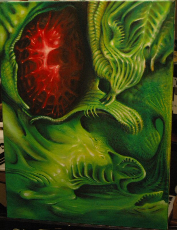
I wasn't even sure which paint blog this was until I looked it up. Apparently, it's Paint Blog III. Hello and welcome. Here is what the work looked like, when last we looked at it:

The problem with this image isn't that it's too bright or colorful--it's that it's too monochromatic. Yes, I know there's more than one color there, but each color sort of lives in its own world. To solve that, I added some light brown and golden hues to some of the "plant life."
Personally, I think it's hugely improved, and might
actually be heading into the home stretch.
In other news, it's
generally amazing how the past comes back to bite us, doesn't it?
Apparently, the lease for my domain name expired some days back, and
the renewal notices were sent to...my AOL account. I keep AOL for
emergencies, basically, and haven't checked the email there in weeks.
More fool me, bless my soul.
Here's some more work on Paint Blog III. We're coming in to the
home stretch, and yes I know that means heartbreak and disappointment
for millions, but the story must be told, and I am the only one to
tell it.
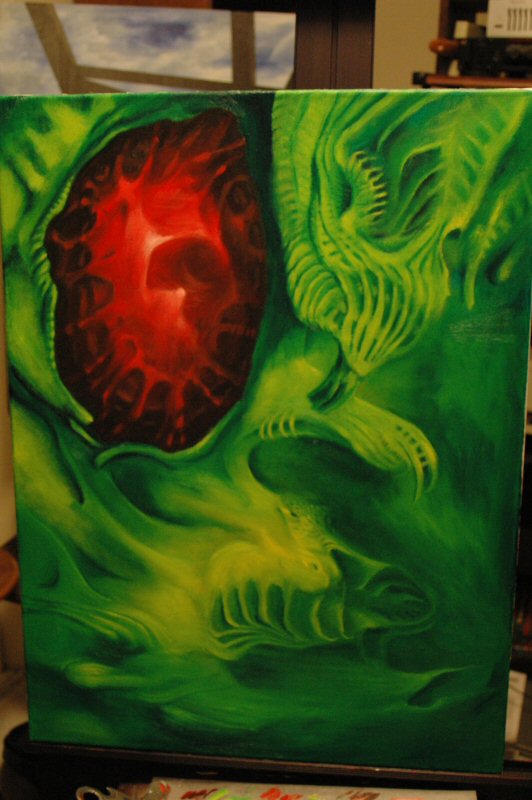
Truth to tell, "more work" here means "but
not much." The background on the right side was darkened up a bit
to try and put it more into perspective with the leaf-thing
mid-center. Here's the overall state of play:
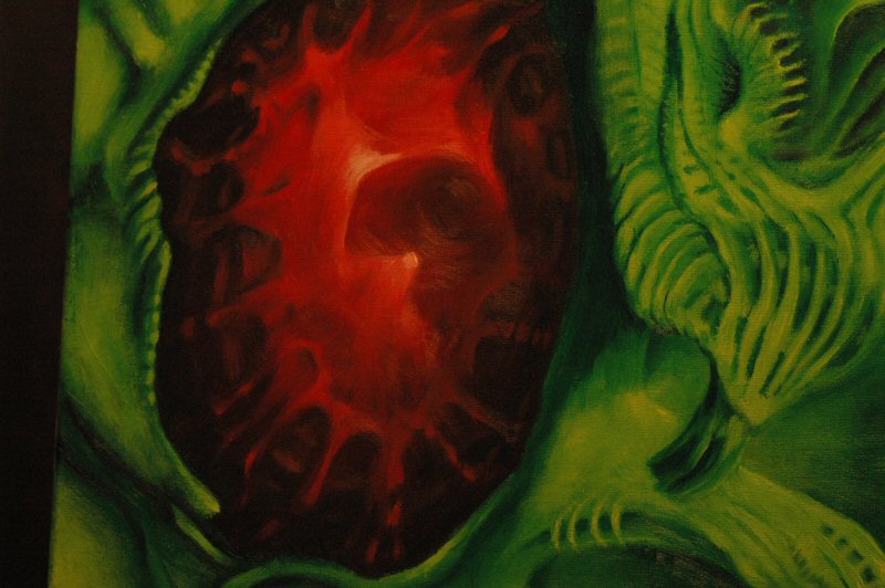
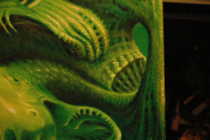
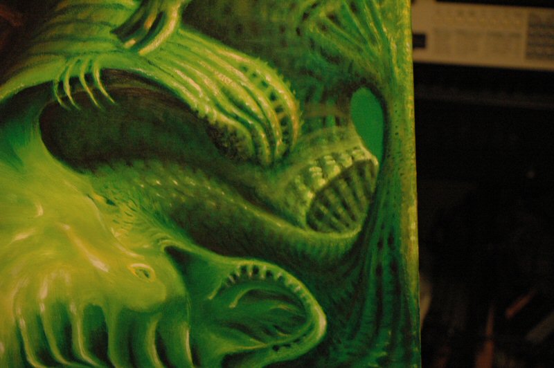
Here's a close up of the background in question. The edges are a bit abrupt, that will have to change a bit. For the better or worse? Who knows, man, who knows.

Aside from that, the only thing that really seems to call for work is this little guy.

I keep thinking there should be something in there, but I have not yet hit upon what that something should be. At first, I thought a red/black area, similar to the bit up in the upper left, but it struck me that would take the impact away from that area. So I've also considered a very light tangle of stuff (like milkweed) or black tangle of stuff (like the inside of a golfball). Neither one strikes me as the "right" answer, but I feel that it will eventually come to me.
So, Paint Blog III is heading into the home stretch. There's been some work done, mostly on the background area to the middle right of the image. Here's what we ended up with after some dabbling:

Here's a detail of the "bridge."

I wanted to add some highlights and, um, lowlights to give the area some detail. Here's what we ended up with, and by "we" I of course mean "I." Which is not to denigrate your contribution, no, not at all. Even though it looks that way, that's not what I meant.

Two close-ups of the new, highlighted "bridge." Regular:

Super-close-up. Well, not really "super," but closer-up than the other one. It's a give and take thing.

Remember how I felt that the little jaw-figure on the lower
right needed something? Well, it turned out he didn't need anything,
much, but the background around him did. So that got darkened up a
bit, and he got some more teeth and some more details himself. It was
like Christmas around his house! I don't have a close-up of him, but
you can see how he worked out in the two overviews above.
So,
that is where we stand. Have fun trying to get your head around that!
Ha ha ha. I'm kind of a maniac, you know. See you tomorrow with more
fun!
Paint Blog 3's background vexed me for a while, by which I mean
the area on the right where there's a kind of loop.
Here's
what I tried at first:
Argh, argh, argh! That's just all wrong. I tried to darken it a bit, to make it a bit less distracting.
This isn't much better, though I can be a bit more calm about
it. And I can see where I can work with it a bit.
I tried
using some faintly milky bands, like splitting skin, but it never
worked right and even worse, I didn't photograph it. I ended up
instead turning the bands into overlapping tubes.

And then I darkened that up quite a bit.

Then the area to the left of that, underneath that little
hanging fist or whatever it is (a uvula), started to bother me. It
was too different from the rest, so I worked with that a bit, trying
to make it blend. I think I got something. But not today.
Stay
tuned tomorrow for the exciting conclusion!

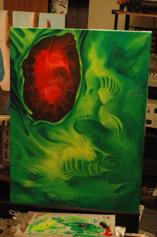
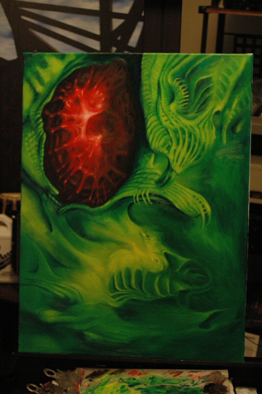
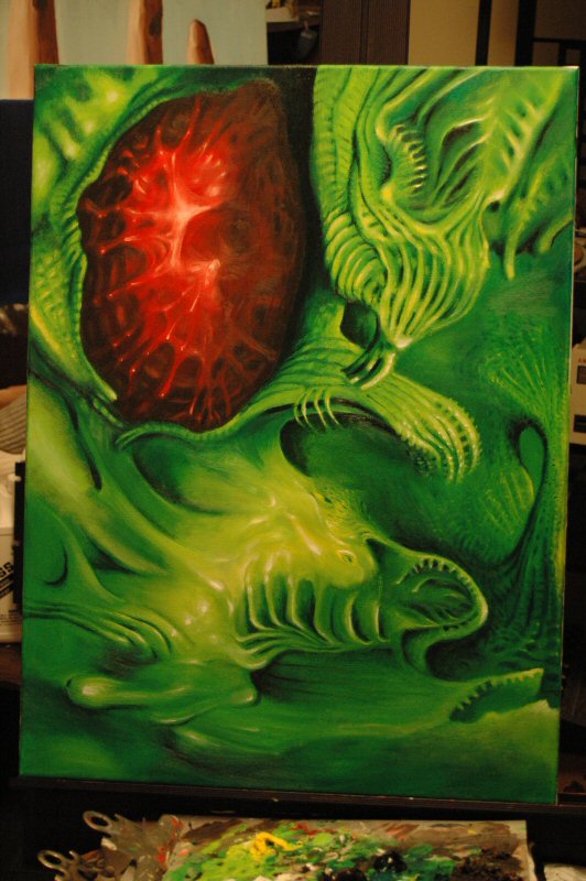
Gentlemen...behold! Paint Blog III is finished! Mwa ha ha ha ha!
Here's photographic proof:
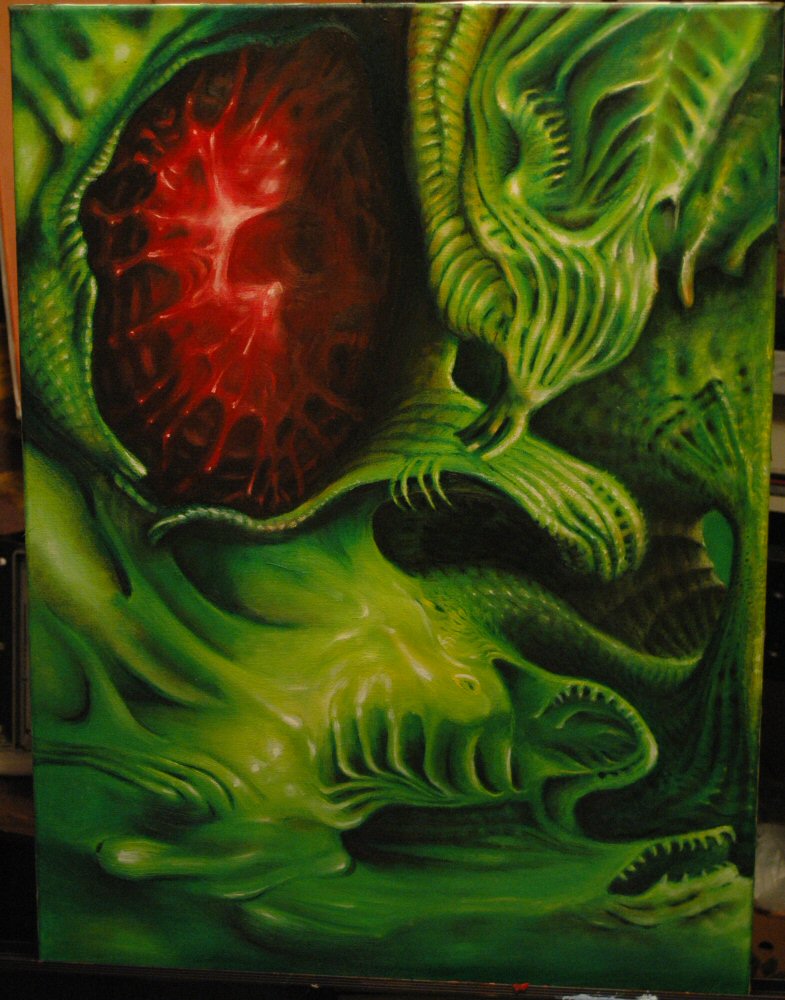
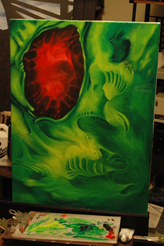
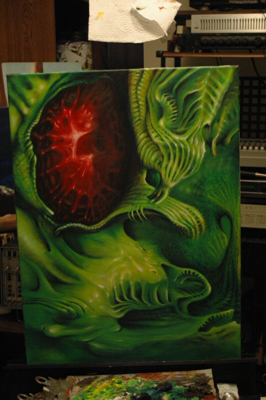
Here's another photograph, which might be more accurate, color-wise! I'm so insane I can't tell any more!
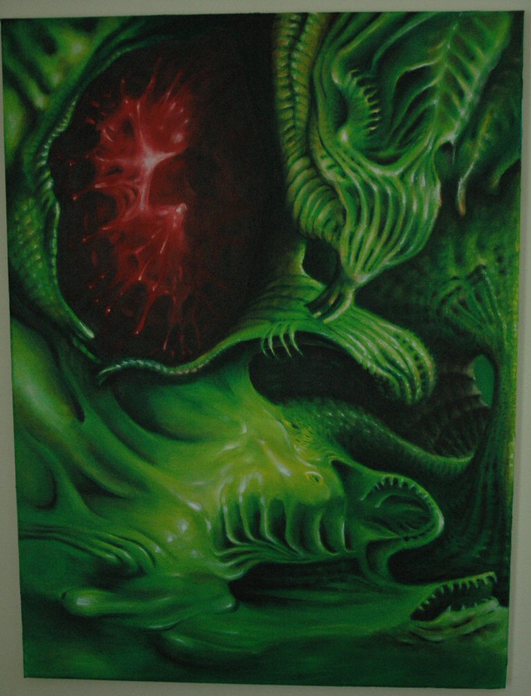

I am one canvas short of a gallery! Mwa ha ha ha ha!