Originally published at An Island Where No One Lives.
Adapted and edited for inclusion here.
__________________________________________
We're here at the tail end of 2004. What better way to say something about
something than by starting a new painting? I don't know, because I actually
started this one a few days back, so it doesn't really count. But it might
have, had I decided to lie to you and say I just began it, just now. But I
decided not to do that, so don't say I don't care. Because sometimes I do.
Sometimes.
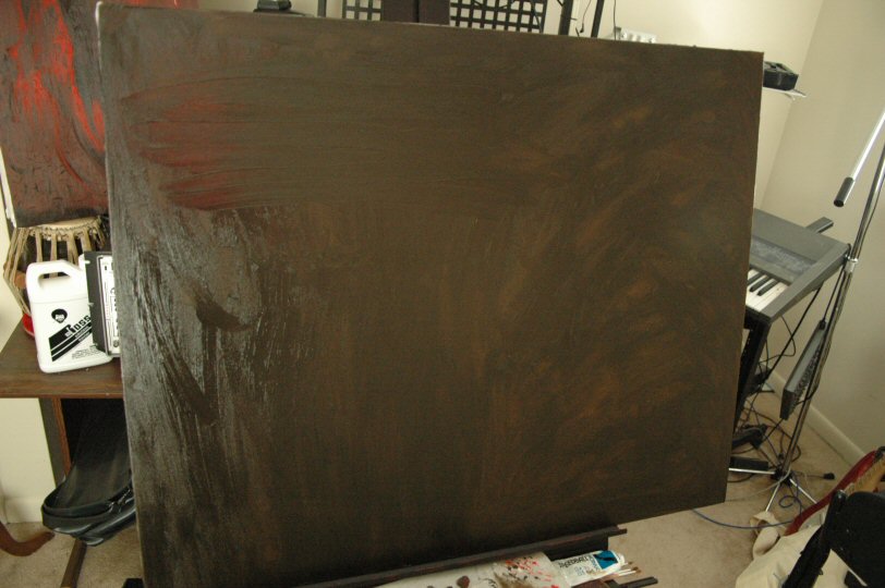
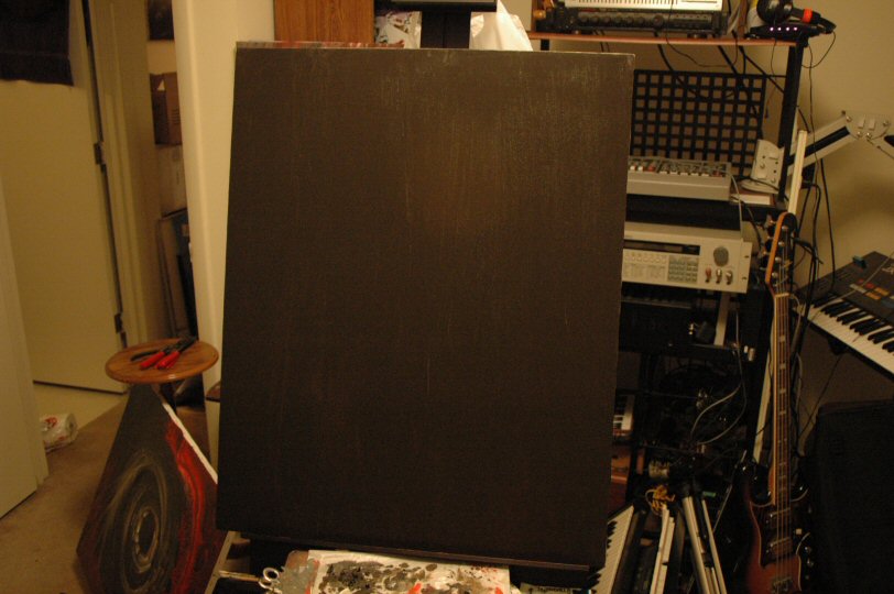
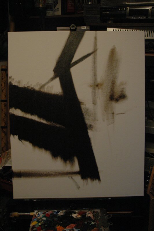
Anyway. I first decided that this new painting should have an all-black
background, and by all black, I mean Raw Umber. In the course of applying
the paint directly from the tube to the canvas and smearing it around with
my fingers, I thought, Hey, this might make a good photo for the blog-thing!
It wasn't the first time I've been wrong, but here's the picture anyway.

Here's the same canvas after I had managed to get paint all over it. You can
see how wet the pigment is by how much it catches the light. You might think
that the reddish-black canvas in the back is also wet because it shines,
too, but you'd be wrong. It just shines. But trust me, the one front and
center is very wet.
I smoothed the paint out as much as I could, gave the canvas a few days to
dry, and then it looked like this.
Note that in this picture, the canvas is oriented in Portrait mode. This is
how the final work, whatever that might turn out to be, will be oriented.
The two pictures showing it in Landscape are oriented such because it's
easier to smear paint on a canvas when it is lying down, as it were.
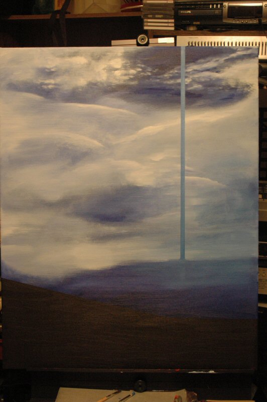
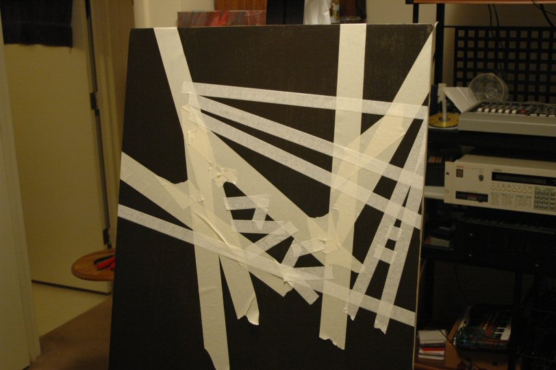
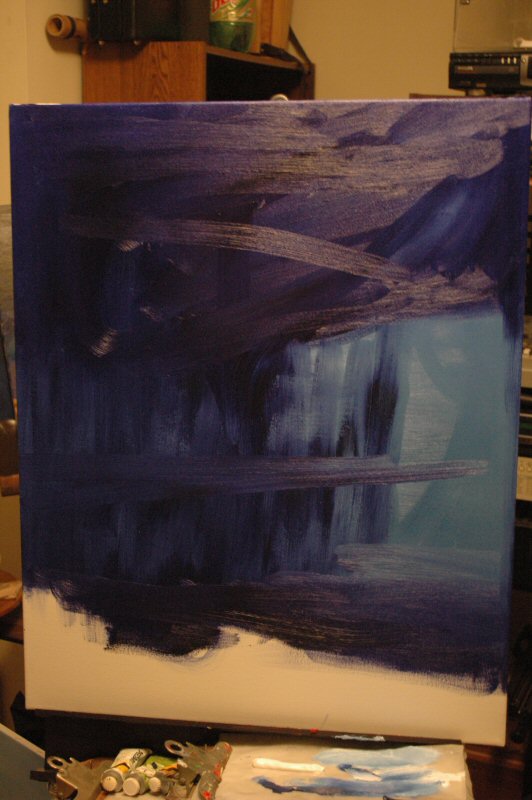
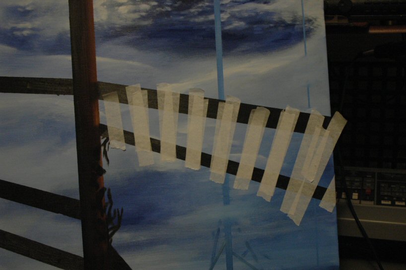
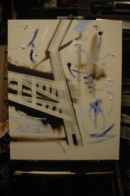
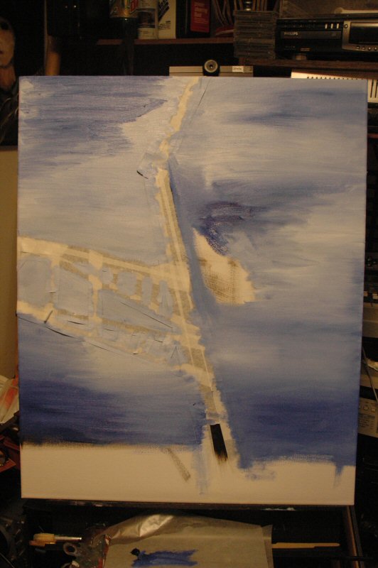
The next step was to wait until some form of inspiration hit. The form that
it took was masking tape. Masking tape is great for making straight edges in
a work; you just line the tape on the canvas, paint up to and over the edge
of the tape, and when you peel the tape off, voila: a straight edge.
However, I didn't want to use tape just to do that. I wanted to create a
lattice or framework of some kind, so I put the tape up where it felt
"right," whether it was or not. Note that the tape is, for the
most part, in the upper part of the canvas (it's actually hard to see that,
isn't it? I was focusing the camera somewhat closer than I usually do, so
some of the canvas is cropped off at the bottom).
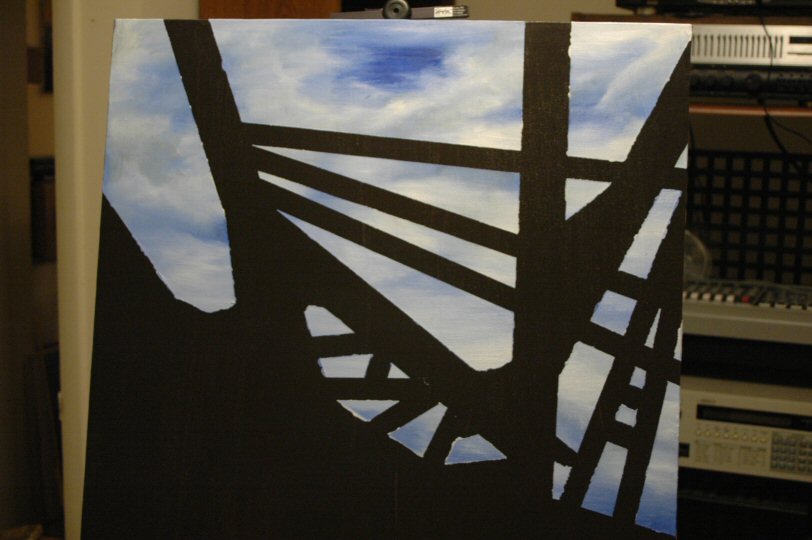
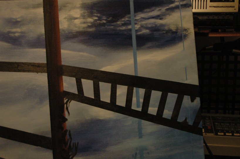
When that was done, I took some time to think about that, about what ought
to be placed in (essentially, behind) the lattice. I wanted the lattice to
appear somewhat like an enclosure, so I painted an open blue sky over the
tape.

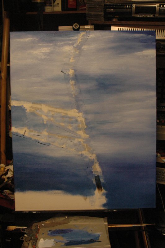
And that's where it stands as of today. I'm still not certain, completely
certain, about the sky, so I may allow it to stand for a while and then do
some more work on it (the lower half in particular bugs me a bit, the upper
half I think is quite good).
And then we take the tape off. Ooo, it'll be just like that scene in Bride
of Frankenstein, remember, where Colin Clive and Ernest Thesiger are
unwrapping Elsa Lanchester, unaware of what they'll find underneath. Will it
be some kind of a monster, or might it end up being something else,
like a completely different monster?
We'll all find out next year. See you then. Happy New Year to you all!
First and foremost, I apologize for the quality of the pictures below. I
have no idea why I looked at these and thought, yeah, that'll do. I can only
say that liquor drinks, or their aftermath, were not involved. The index
file containing the previous chapter of this, and all chapters of the last
PaintBlog, can be found here.
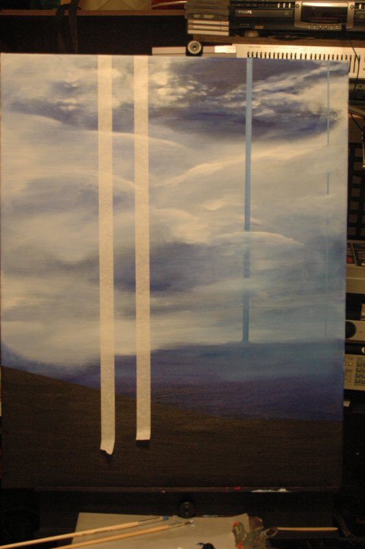
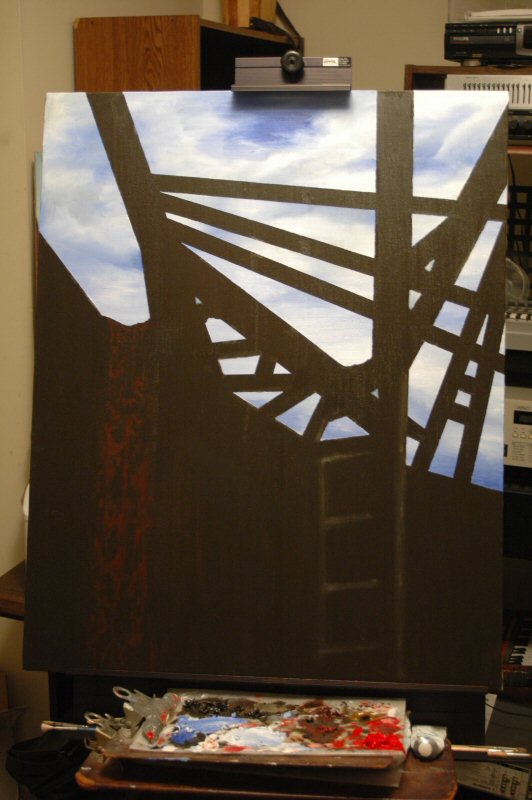
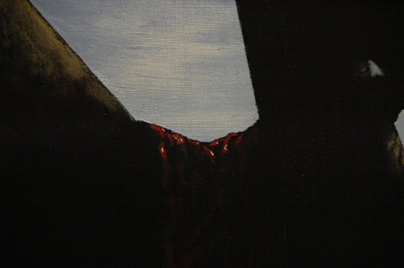
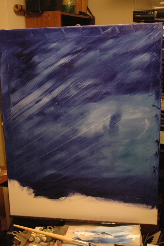
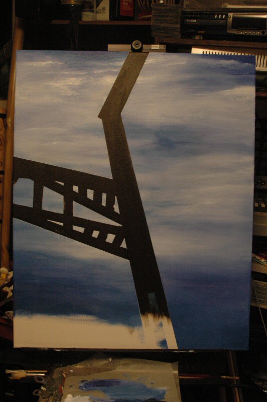
As promised in our last installment, we will now see what happened when the
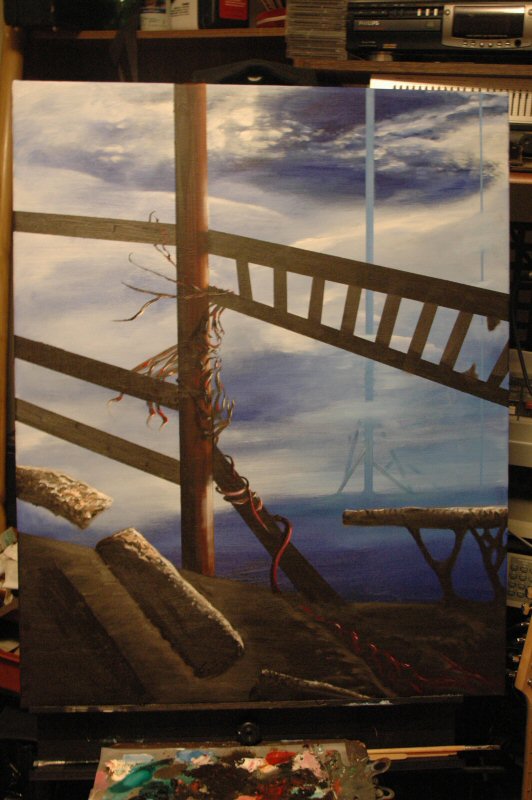
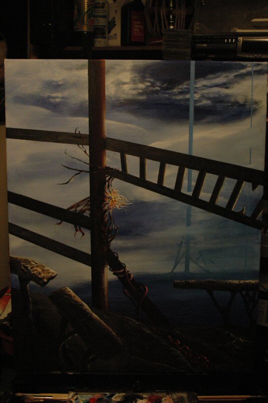
masking tape was removed. Frankly, I rather like the effect. It looks like
we're underneath an abandoned railway trestle or whatever those things are
called.
(I've decided to have the pictures open up in a new window from now on.
Let's hope I remember how that works.)
I added by hand a couple of smallish triangles to flesh out the concept of
boards haphazardly strewn.

You can probably see that the masking tape doesn't always give a smooth,
straight line. Many times this depends on the amount of paint used to
overlay (I used quite a bit) as well singularity of direction. Since I
wanted to fill the spaces, I went both left and right with the brush and
probably helped to get paint beneath the edge. Further, an
advantage/disadvantage with masking tape is that its hold on the canvas is
fairly weak; this is good when you want to take it off (you're not pulling
paint off with it) but not so good for keeping the edges tight against the
canvas.
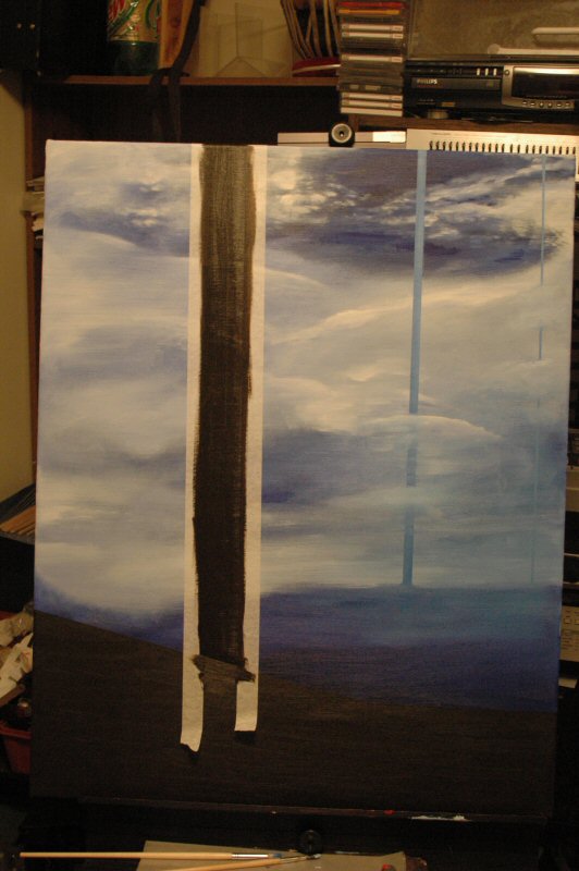
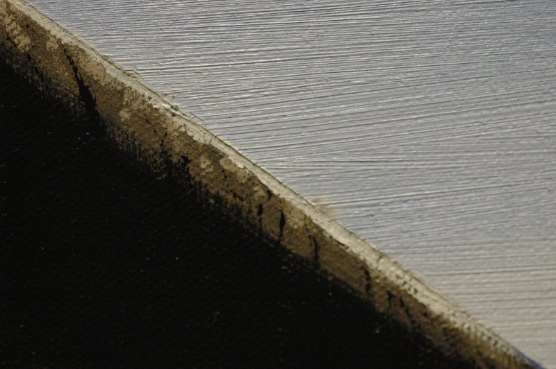
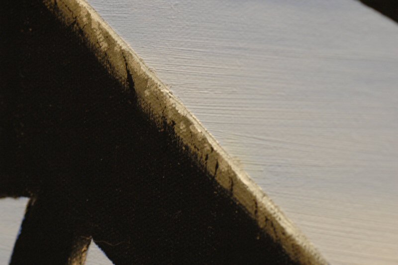
All that is prelude to this close-up shot:

That's supposed to be four straight lines making up an irregular rectangle.
These sort of blobs and smears are all over the "straight lines"
of the canvas, so I've got quite a bit of cleaning up to do. White tends to
take a few days to dry, so that will probably be Wednesday or Thursday
before anything is done.
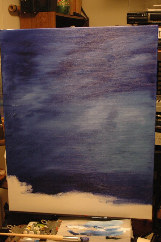
Patience is a virtue which I can, at times, exercise but sometimes you
just get seized by an idea or notion, and patience is usually the first to
fall. Which is my way of saying that, instead of waiting until Tuesday or
Wednesday to straighten out the lines in the painting (as I said in the last
chapter), I decided to do so last night. The results are pretty successful,
I think.

Now comes the real waiting game: courting dame inspiration to help with
the rest of the work.
Here's the latest addition to Paint Blog II.
As too many times before, the photo is a bit too shiny, especially on the
black areas, but it was the only way to get the brown detailing to show up
at all. Sorry about that.
As for the work, this one is going to shape up to be something more...recognizable
than the others, at least in terms of environment. This looks like a place
humans might be familiar with. Any humans out there agree with that?
The touches in this one are subtle and softly shaded, and at first I wasn't
sure but they soon began to grow on me. I may feel completely differently
tonight and paint it all out, though. Life is exciting at times, yes.
A mistake I almost made: using burnt sienna's brother, raw sienna. I like
the color of raw sienna, but in every tube I've ever encountered, the
consistency of the paint is like glue. It's almost impossible to work with,
so I tend not to.
One of those joys in life that we deliberately shut ourselves off from, eh?
Well, no, not really, it's only raw sienna.

I like looking at this one, the way it is now; unlike most of my other works
it's actually a bit quiet and relaxing. When I look closer, though, the
menace is there, just a bit more subtle.
It also seems pretty vacant, as if any lifeforms to be found have long since
moved on.
It is going slowly. Some of the black areas seem content being the way they
are, and my demented creative spark thinks, Oh, that can't be right.
I've got to mess them up!
I also can't help feeling I've chosen a bad "camera angle" for the
viewpoint. But it can't be helped without square-oneing the whole thing,
which I am loathe to do.
With some work, it may all work out in the end.
Or not. We'll see.
Well, after being absent from PaintBlog II for a couple of weeks, I decided
to see if I could do something with it. Could I do anything with it? The
answer, surprisingly, is yes, but not much. Mostly little ticks of detail
without a change in overall direction. None the less, I do like the
direction we're heading with it.
I'm going to present a series of six detail shots first, then finish up with
the overall shot. Some of the detail--the latter ones, of course--are a
little darker than I like, but one can't have everything.
Making one plank look like weathered stone:

Doing the same for another plank:

Changing the pole to a more wooden appearance, separating the ladder from
it, and joining the ladder to a plank above it:

The top of the red area. You knew I was going to do something like
this, didn't you?
Well, you certainly knew I was going to do something like this.
Admit it, now.

Finally, highlights on the metal of the ladder. This definitely needs some
more work. Is it both shiny and corroded, or badly made metal, or badly
painted painting? Viewer's choice! Be sure to hand your ballots in by
Wednesday.
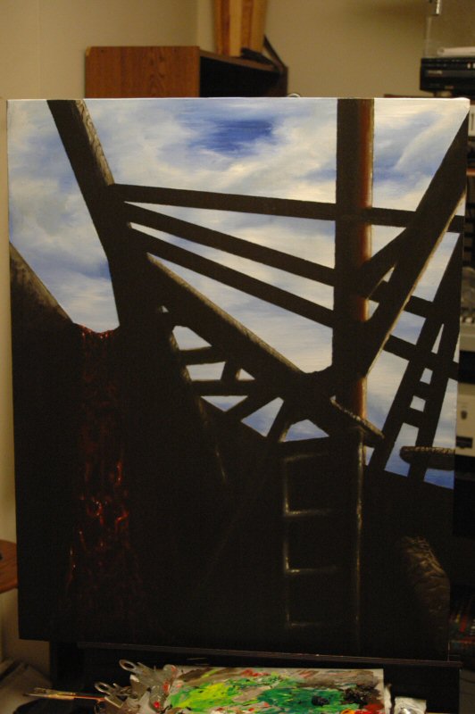
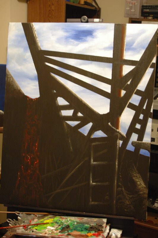
And here we go with how the canvas looks as of today, at the end of January:

The image is still coming along nicely, I think, but it definitely lacks
something; I think that something is drama. We'll have to wait to
see if anything dramatic occurs. It's a lot like life, isn't it?
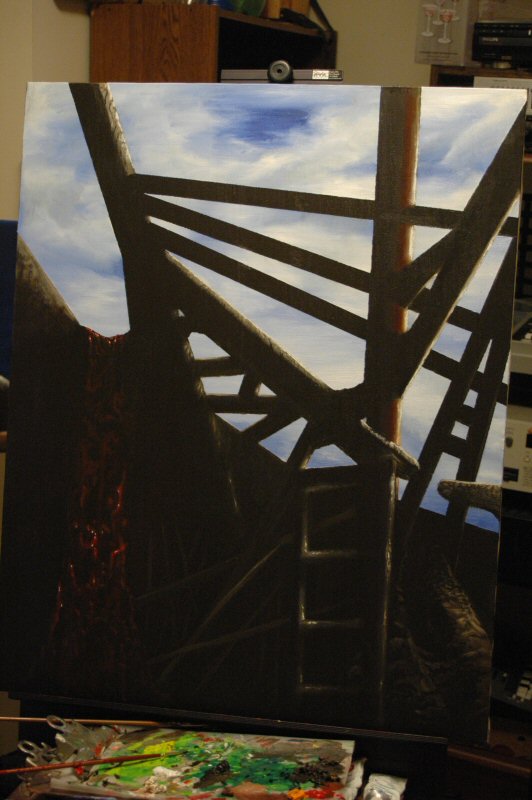
More PaintBlog II work. A bunch of highlights here and there, a lot of them
added and a lot of them immediately taken away. Then, I added a board or
slab or rock or something to the lower right corner.

Like the ALT text says, that simply doesn't work. It is way, way
too light. But I knew it would be too wet to work with, so I let it rest
(after taking a picture, just for you guys. Ain't I swell?).
The next day, I darkened it up and added some cracks and stuff. Oh, and I
also added (it's very hard to see in the photo, sorry) a 45 degree (more or
less) angled beam just to the left of the ladder. It's there, trust me. It
really adds a lot to the work.

Then, I went in and completely redid the rightward slab. I added and
subtracted and painted over and over, and got a great set of ridges and
cavities and such like:
I like it. It looks like an age-worn rib of some immense, er, thing. I'm
thinking it adds even more to the work. And I'm thinking maybe it needs some
friends.
Wednesday, February 23, 2005
Question: What's wrong with this picture?
If you say, "Well, you painted it, for one thing," you can
go to the head of the class, but you're probably not going to get any supper
young man.
If, on the other hand you say, "There aren't any black outlines in the
real world," that's much more what I had in mind.
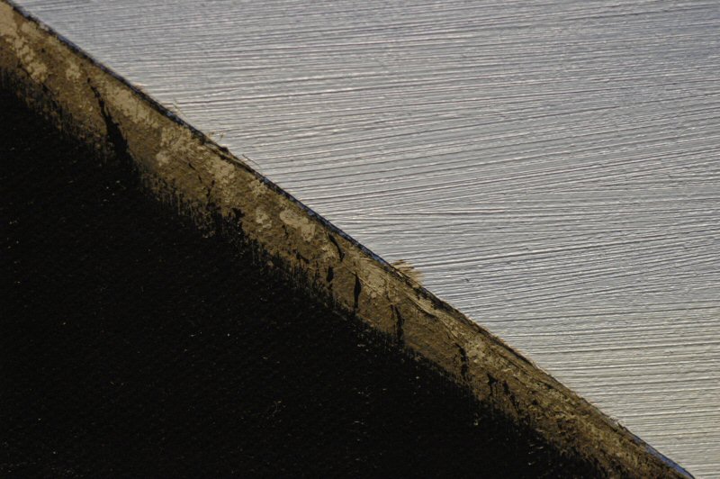
How do we fix this? Like so:
Notice the difference? If you say, "Sure--you ruined it," you're
bucking to get no dessert either young man.
The rest of you might be saying to yourself, "That still looks like
there's a black line there," to which I say, "Ha ha, you're talking
to yourself." Then, I point out that it's actually just the shadow from a
paint ridge. Here's another picture, taken from a different angle, to show
that I speak the truth.
I added some boards and poles or something to the lower part of the painting.
It really looks like someone needs to clean up in there. Here's a painting of
how it kind of looks. This is way overexposed to show the detail. Also,
there's reflection from the top of the canvas, because I didn't notice it
while taking the picture.
Here's a photo showing more like what it looks like in real life. Notice how
you can't really see anything. That's the tricky part. Also: the same
reflection in the upper part. That's right! I didn't notice it a second time.
I'm on my way to that swell prize.
April 21, 2005
I've done some extensive work on Paint Blog II, without adding a single
brushful of paint to the canvas. How is this possible? Normally, I wouldn't
give away such a valuable secret, but since that's the whole point of this
episode, I guess I will.
First of all, speaking of brushfuls of paint, here's a new brush:

I've been needing some large style brushes for a while (usually I use my
hands) and A.C. Moore has some very good and very inexpensive ones.
Anyway, how can I radically alter Paint Blog II without adding any paint?
Simple. Turn it into one half of a diptych (the fancy term for a work
comprising two paintings).
Why, it's so simple, a child could have thought of it! But he or she didn't, I
did. So the first thing I did was to put some blue and white on a canvas.
Unfortunately, I used the wrong shade of blue (one that is slightly warmer
than the shade on Paint Blog II), so I had to do that over.
What I did was put paint directly on the canvas in little blobs that look like
slugs. Viz:

This then gets all spread around and mushed around and generally is forced to
cover most of the canvas. (Note: Despite the rather purplish appearance of the
photos to follow, they're not actually purplish. I think it was the lighting
in the room.)

This results in a huge thick mass of paint on the canvas, which, I can tell
you from experience, is very hard to work with. We have to get the excess
paint out of there. And here's how.
Many canvases come with these little bits of wood or plastic that, I think, is
supposed to keep them from warping or something. They never have any
instructions, but they're always there. Here's one of them.

This will be used in conjunction with a space-age plastical
drinking cup, like the one below.

Actually, the one pictured above was the very same one
used in this operation.
What we do, is use the little wooden bit and scrape it across the canvas,
gathering up the excess paint, and we then scrape the wooden bit across the
lip of the cup, and repeat the process. At the end, the canvas looks like
this:

And the cup looks like this:

The little wooden bit doesn't get an "after" photo as it would have
been too messy to try and hold it and photograph it. Trust me, though, it gave
its life dearly, but in a good cause.
The canvas gets some more work:
And some more work. Below, we've started smoothing out the
remaining paint so it doesn't look like a bunch of scraped paint.
Finally (for now), we add some cloud details, trying to match
the left edge with the right side of the original Paint Blog II.

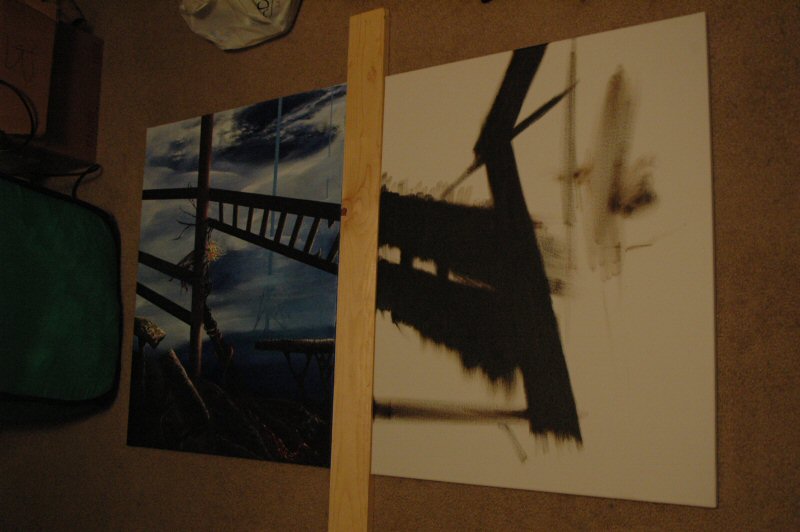
This is a not-very-good photo of the two of them together.
While it looks as if the color is way off between the two, trust me, it's not
the case. They actually look pretty good together.
Now, we're going to let it dry some more and put some details
in the clouds. Then, we start on continuing the structures on Paint Blog II
over this new canvas.
Details as they appear.
May 10, 2005
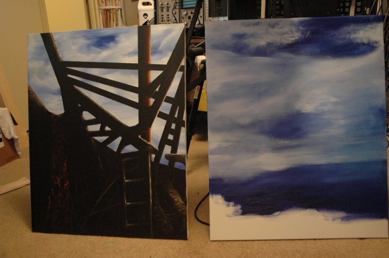
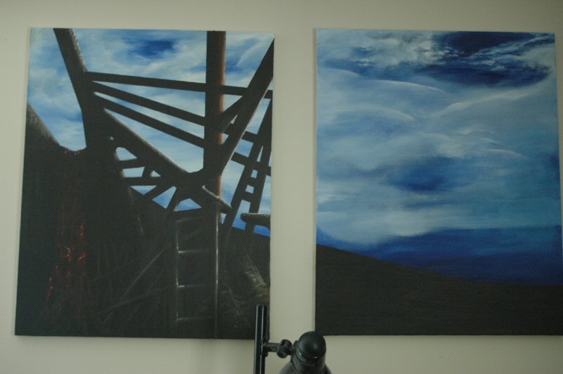
This seems scarcely worth mentioning, but the canvas on Paint Blog II (Part
II) is now completely filled, which as you might recall from previous
chapters, is a big deal for me, etc etc etc.
I've been too busy to do more lately, but it's still simmering. The thing in
front of the two works, by the way, is a lamp though not an anglepoise lamp.
Some work on Part B of Paint Blog II. First of all, I wanted to continue the
idea of the upright columns. So I thought it would be good to put one in the
distance, making it blue as if it were covered by atmosphere. Here's the
preparation for that, next to the result with the masking tape removed.
That one worked pretty well, so I thought I would add another even further
in the distance to increase the depth of the world we have here. Again with
the masking tape, then the result, with both columns slightly obscured by
clouds Also done to increase the three-dimensionality. This reminds me of a
guy named Richard Powers, who painted a lot of science fiction book covers.
Finally (so far), I wanted to add another pole closer to our POV, to
parallel the one in the other canvas. So we start with the masking tape.
This time, instead of using blue and white, we used raw umber (aka black)
since this one will be closer and thus, more detailed and less muted by
intervening layers of atmosphere..
That's how it stands as of now. The tape is still on because I have to add
some more colors and details after it dries. I'm pleased that this canvas is
starting to get going again. (Now if I could jump start sound recording, and
make a million dollars, I'd be happy.)
As of November, 2005. To be continued.
For an unexpected reason, Paint Blog II suddenly got some work done on it.


I have no idea where the spark came from--as usual--but it seems to have left as soon as it arrived.
As of March, 2006. To be continued.
June 22 - July 3rd
Working on paintings that are supposed to be representative of some kind of reality (as opposed to simply realistic) is something that can't be forced, which is why Paint Blog II has taken as long as it has. Since its beginning at the end of 2004, I've begun and completed other works while this one waits patiently, knowing that its day will come, then go, then come back again, until one day it will stand complete. It's important to get it "right" in the aspect of an environment; other, more abstract works can have some invention inflicted on them, usually with positive results.
Anyway.
When we last left this work, it was back in March. (One thing I've found out was that I have no shots of the overall appearance of PBII as of the time I last worked on it.)
I think the reason there aren't any overview shots is that at the time I put the brush down, I made a couple of tentative marks along the bottom of the canvas that would become further structures. Here they are (this is the lower left hand corner of the work):

Apologies for the lousy photo. Most of the photos in this update are pretty lousy, the reason being that it's a pretty dark work (lots of raw umber) and hence needs a slower shutter speed to see anything other than a dark mass. But a slower shutter speed means the possibility of blur, so one has to be steady. Here's another photo of the same image, slightly lighter to show the (ick) detail better.

Sarge, they're dropping packing foam on us again. In a word, ecch.
I didn't want to post an overview photo with those on it. But now we're
ready to work on them. So let's add some details, roughen them up so they look like old concrete or stone.

Not bad, well, at least I can stand to look at them now without groaning. Of course, they're floating in mid-air, but we'll deal with that later. Here's a wider shot of the tableau, the details added a bit more. You might notice something in the upper center of the picture, clinging to the central support. We'll get to him in due time. Right now we're going to concentrate on the bottom of the painting and the work done there.

Let's add a support under the floating thing at the right edge, and add a tentacle or two while we're at it.

More tentacles would be good; they always are.

Some "stuff" that might be sprouting these tentacles. Just vague enough to be interesting, and then (later) reworked to be even more vague. 

And below, a wider shot of this, showing some ground details and some added roughening of the floating slab to the right.
Back to the original two slabs, I then added some supports for them, so they are no longer floating. These were supposed to look metallic, but I liked the way they almost look organic, like they're legs for the slabs, so I kept them vague-ish (this photo is much lighter than the actual work).

More ground details added. Highlights on the eath, more (and reworked) highlights on the organic mass, some details on the floating slab at the right.

The floating slab on the right, closer.

This shot's pretty dark, but it's the ground near the red area.

Another dark shot--man, was I drunk or what?--of the red area itself.

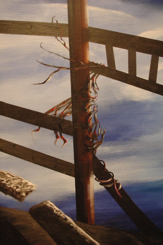
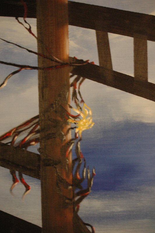
Finally, the area where the tentacle grasps the support beam. Some subtentacles were added and highlighted.

In
the next series of photos, we'll look at the guy in the middle, and get an overview of the work so far. Plus, a surprising new development.
In the photos above, you might have seen a vague whirl of something near the top of the photo area, clinging to one of the support beams (in the work). I mentioned
previous that we'd get to him soon, and that soon is now.
Also as mentioned, I don't have any overview shots of the previous stage. I do, however, have a shot that shows this guy's tentative origin. It's right here:
That's him in the lower-middle-left, right below where the ladder joins the support beam. I can't recall why he was added, though I suspect it was done to hide some spillover of raw umber onto the surrounding sky; I'm sure I had some brilliant scheme in mind. I tend to, you know.
Well, in one huge rush of work, he went from what you can kinda sorta see above (if you look really hard) to this:
You can also see the tentacle and the floating slabs referenced in the previous chapter. I'm not sure if the tentacle is part of the guy, or he's part of something larger below, or if they're two separate creatures. There are other possibilities, of course. Viewer's choice. Here's a picture showing the overall view of the work thus far. You'll note that the lower part of the canvas is priot to the state we left it in last chapter.
Much as I liked the guy above, he seemed incomplete. How about another structure, yellow and white this time?
Now this is starting to look good, I think. It looks almost fungal. Like this guy's clambered up these supports and got himself comfortable, and is sprouting a fruiting body. More of that could only be better, right?

And even more, including some dark structures inside, to give the idea of anatomy.
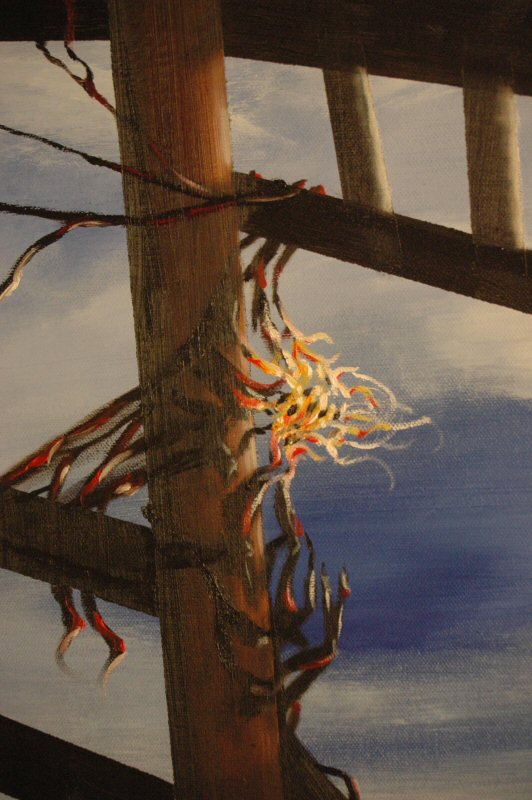
He ended up with a few more white filaments reaching toward the ladder, but this is the last of his closeups. This is pretty much what he looks like now. (Except for the glare on the paint, of course.)
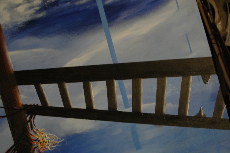
Speaking of the ladder, it got some highlights:
Now, we come to the overview shots. These were taken at various times during the work on both the floating slabs and Mr. Fungus.


Now that I look at these, they all seem to be the same damn photo. Oh well, I guess I was trying different exposures or something. Mr. Fungus, in the last photo, has had some more personal growth, so at least that's a difference. That's how the work currently stands as well.
(Okay, I went back into PSP and looked at the photos. In the second one, the ground area in the lower right has been darkened up some. Some highlighting was added in the same area on the organic thing in picture three. And as noted, Mr. Fungus had his hair done in the fourth. So they're all different, just not much different.)
What was really surprising was how well it all looked. Here's the worst photo of them all, showing the two canvases together on the wall (behind a lamp) as they're meant to be seen. Only in a better photo. This one really needs an apology but I'm tired of issuing those.

Actually, the lamp works pretty well in that photo, doesn't it? I'm going to try to get a better picture...someday.
I like the look of these, though they are a little bit Time-Life-ish. Time-Life would do these paintings of environments with dinosaurs or sealife, and then in the corner they'd have the painting as a black and white outline, with numbers to identify all the beasts therein. That's what this reminds me of.
It said something else, though. It clearly said, I'm not finished. And I knew the direction in which I needed to go.

That's right. PaintBlog II has gone from being a diptych to a triptych. Cool.
The
next series of photos will detail the beginnings of this third panel.
Happy Fourth of July to everyone, and happy 230th to the USA.
Below, I’ve got photos of the progress so far on panel three of PaintBlog II.
Here, we have the two canvases side by side, so as to judge horizons and line-ups and such. Masking tape was duly placed over the areas that I wanted to keep sky-free, and panel two was put back up on the wall.
Below, we have paint applied directly to the canvas. I usually find this is quicker than trying to brush it on bit by bit.
Then, the initial smearing.
Right around now, I realized that the blue was slightly different than the blue on the second panel. So found another shade of blue and started blending them in. Here, in this flash photo, you can see…well, since I used the flash, it doesn’t look like they’re different at all. But they are. The one below has a slight hint of green in it.

Anyway, some more shots of the paint being blended, then detailed. Trying to match cloud areas with panel two.

Finally, the tape is removed. Voila.
Here they all are on the wall together. The photo is pretty dark; sorry about that. As you can see, I need a bigger wall. But I think they look pretty good together.

I’m not exactly certain where to go next, so I may put this work aside for a while. Maybe a day or two, maybe a month or two, maybe even longer. It all depends on where it wants to go.
As of July 4, 2006. To be continued.
Return
to the Essay Page